
Project Description
Impact
*All results measured through live A/B testing across product page variants.
Research & Analysis
I combined four sources: live A/B tests on existing page variants, usability sessions to watch where people hesitated, user interviews to understand trust concerns, and a competitor review of leading health and e-commerce platforms.
Two things came up again and again. Users did not understand what they were actually buying. "Will I just get a number I can't interpret?" was a real fear. And the brand did not feel credible enough yet. Lab certifications, delivery information, and what happens after the test were all either missing or buried.
Usability Testing Findings
I ran moderated usability sessions on the vitamin D product page with target users. Five clear patterns emerged: price wasn't visible enough above the fold on mobile; the variant selector didn't update content when users switched options, making choices feel arbitrary; users wanted an FAQ specifically addressing lab accuracy and certification; the 'how to use' instructions were buried too low; and the page tried to say too much, burying the three facts users actually needed: price, biomarkers tested, and test type. Every design decision in the redesign addressed one of these five findings directly.

Testosterone A/B test results shown as an example of iterative A/B testing for product design optimization.
The Challenge
The product had real demand. People searched for these tests, landed on the page, and still did not buy. The page was working against them. Too much text, weak hierarchy, and no clear story about what would happen after they ordered. Trust was low and the process felt opaque.
What I Designed
Information Hierarchy
The page was trying to say everything at once. I identified the three facts that actually drove purchase decisions, price, what biomarkers the test covered, and what users would receive back, and restructured the entire page around that priority order. Everything else moved below the fold. Less cognitive effort, faster decisions.
Trust Signals
I added lab certifications, a clear explanation of the testing process, and delivery information in the right places. Small things, but they answered the questions users were silently asking before they left.
Step Process Flow
Users feared the unknown. I designed a simple visual flow showing what happens after they order: collect sample, send it back, receive your results with guidance. This reduced the "black box" feeling significantly.
Subscription and Variant Clarity
CTA and Layout
A/B testing showed the call to action was too easy to miss. I improved its placement and visual weight based on test results, not assumptions. The first test showed +19.57% add-to-cart uplift at 93% confidence on the testosterone page. That gave us enough signal to roll out the layout changes across the full product catalogue, where they averaged +43% across all pages.
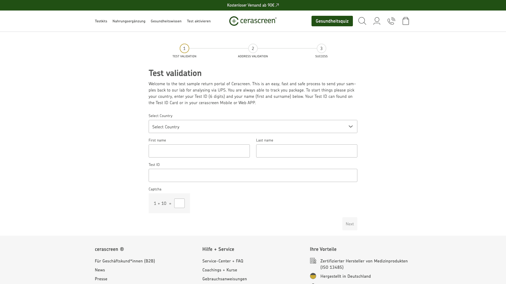
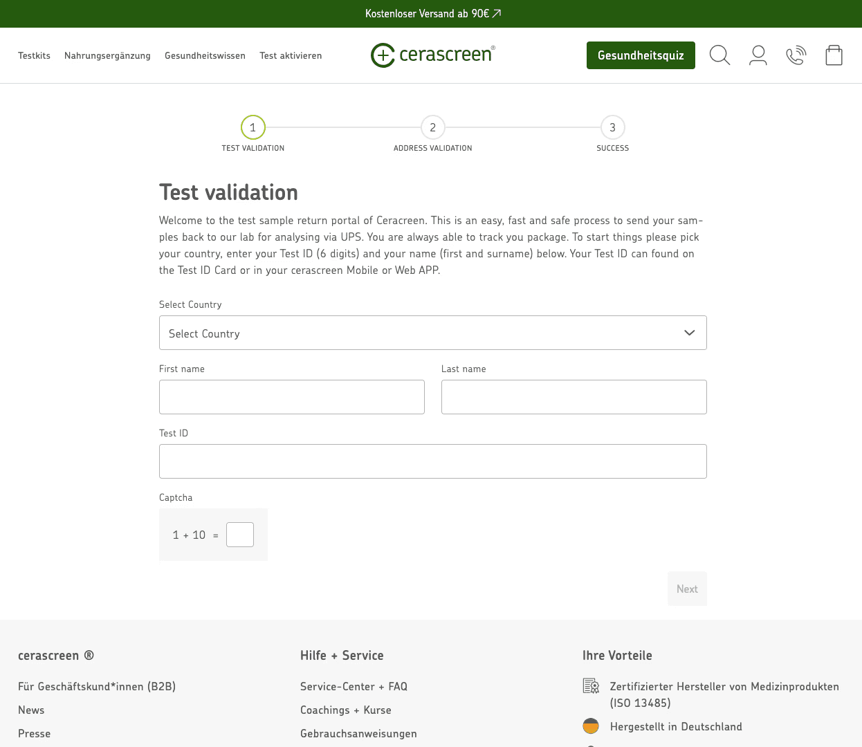
Sample Return Flow
After purchase, customers needed a simple, self-service way to return their sample kits via UPS without contacting support. I designed a three-step web portal, test validation, address confirmation, and return label generation, now live at cerascreen.de/pages/return across multiple markets and languages.
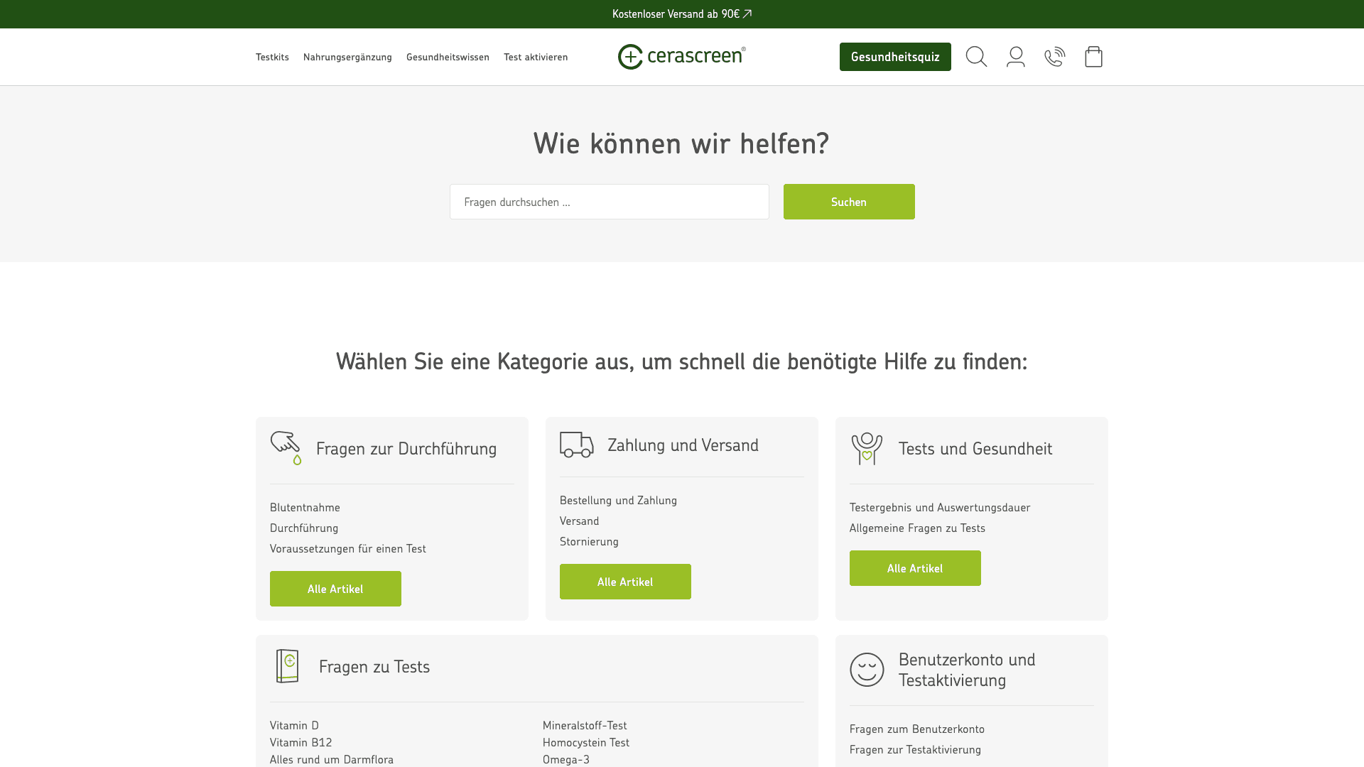
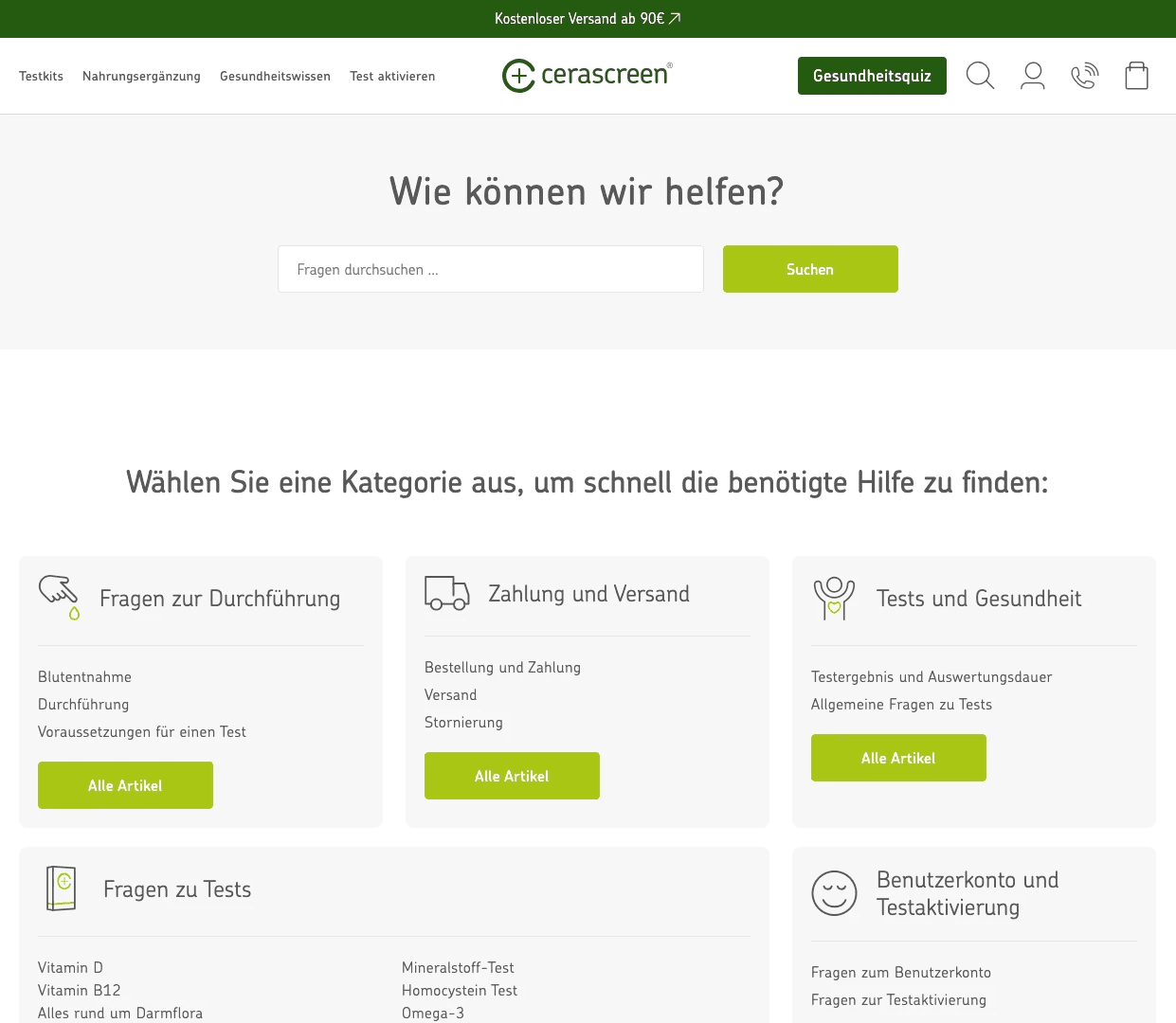
Help Center
Customers needed self-service answers to reduce reliance on support across markets. I designed a searchable help center with five categorised topic areas covering test procedures, shipping, payments, and account management, now live at cerascreen.de/pages/wie-konnen-wir-helfen
Reflection
Collaboration
I worked closely with the PM and the marketing team throughout. Most decisions were validated through A/B tests before anything went live, which made stakeholder conversations much easier. Data removed a lot of the debate.
Results
Add-to-cart improved by 43%, engagement went up 32%, and revenue per visitor increased 24%. All measured through live A/B testing across product page variants.
What I Learned
Health products carry a different kind of uncertainty than regular e-commerce. People worry about what they will understand, not just what they will receive. Designing for that kind of anxiety, not just for conversion, is what made the difference here.
I also got much better at using A/B testing as a design tool, not just a validation tool. Running tests early changed how I prioritised what to work on.