Research outcomes
The research confirmed that improving trust cues, clarifying product value, and reducing friction in the checkout process would have the greatest impact on conversions. Findings also highlighted opportunities to connect user symptoms directly to products, provide supportive visuals, and enhance cross-sell potential.
Insights were prioritized using an effort–impact matrix, focusing first on changes that could deliver quick conversion wins while laying the foundation for long-term improvements.
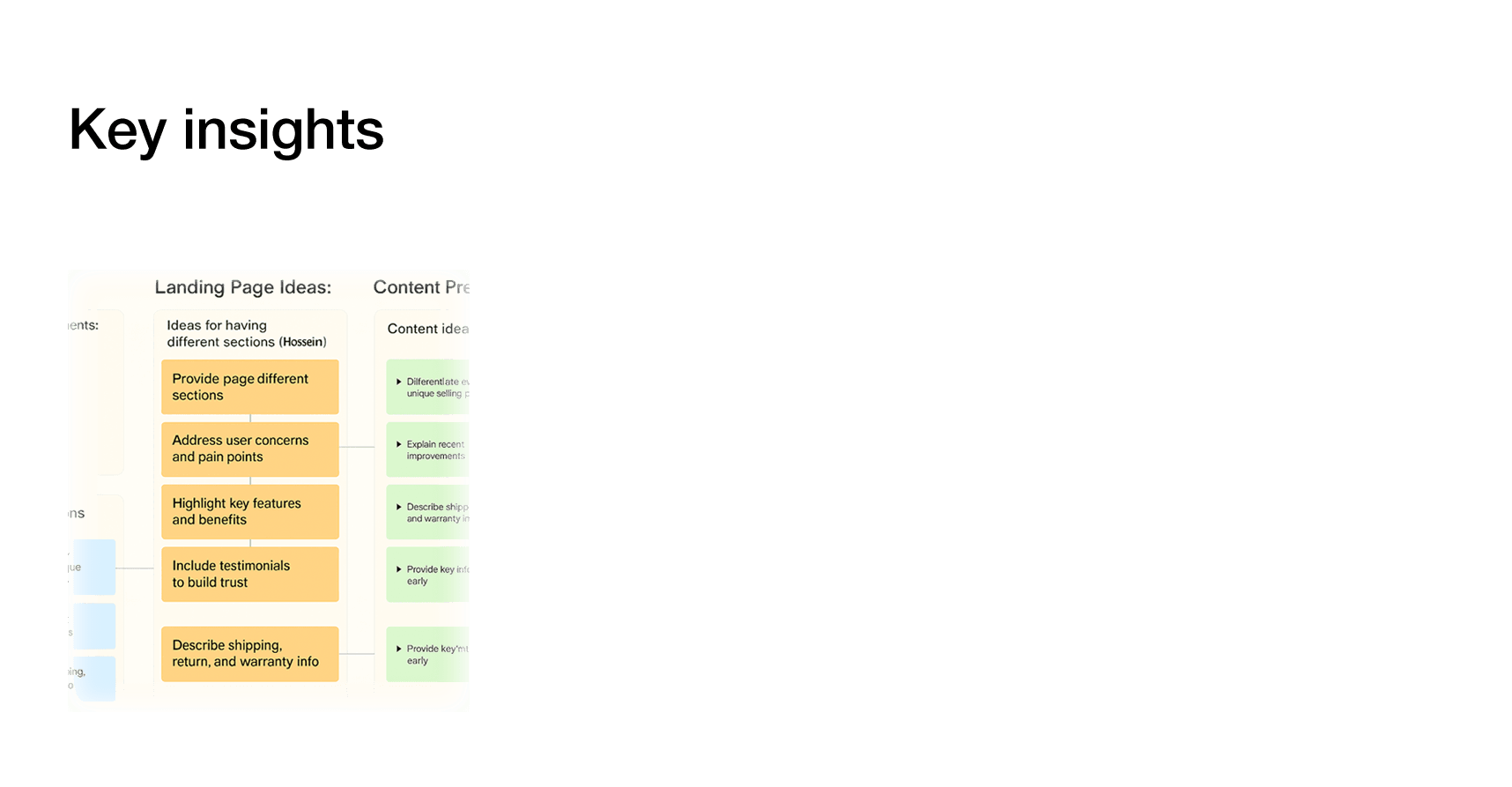

Research showed that streamlining product information, reinforcing trust signals, and reducing decision friction would likely improve conversion. These became the foundation for our ideation phase.
Design & iteration
Guided by user research, internal collaboration, and focused ideation, the design phase aimed to translate insights into a clear, trustworthy, and conversion-driven product page experience. During this phase, worked closely with PM, developers, and QA for sprint-based alignment; participated in daily standups and stakeholder reviews. Marketing was looped in to align product benefits with campaign messaging. The goal was to balance business objectives with user needs—making key information more accessible, reducing friction, and visually reinforcing product value.
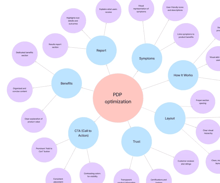
Sample product page design
The final product page design was shaped by focused ideation and user insights. Key improvements included:
A clean layout with clear visual hierarchy and smart use of whitespace
Prominent, consistent add-to-cart buttons with better mobile visibility
Trust-building elements like customer reviews and certification badges
A concise product benefits section with value-first messaging
Symptom-based product linking with supportive visuals
Simplified result reports and an easy-to-follow “how it works” section
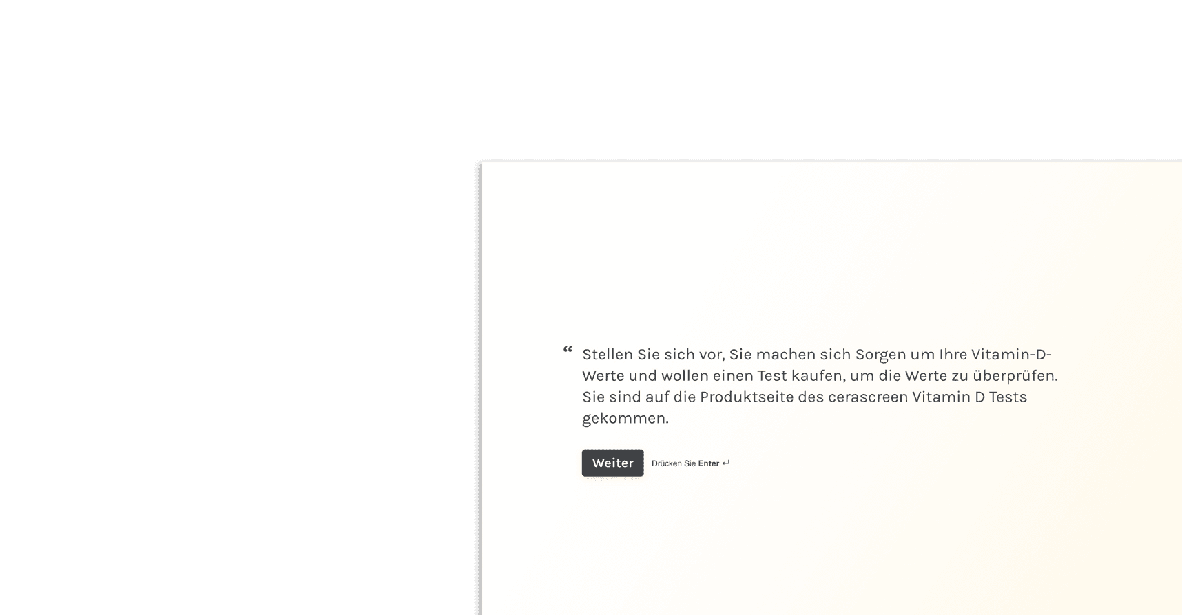
Testing focus: vitamin D product page
We tested the redesigned flow for the vitamin D test page with real users to evaluate clarity, trust, and ease of use. The flow included key sections such as pricing, test instructions, and result accuracy — all optimized based on direct feedback from usability sessions.
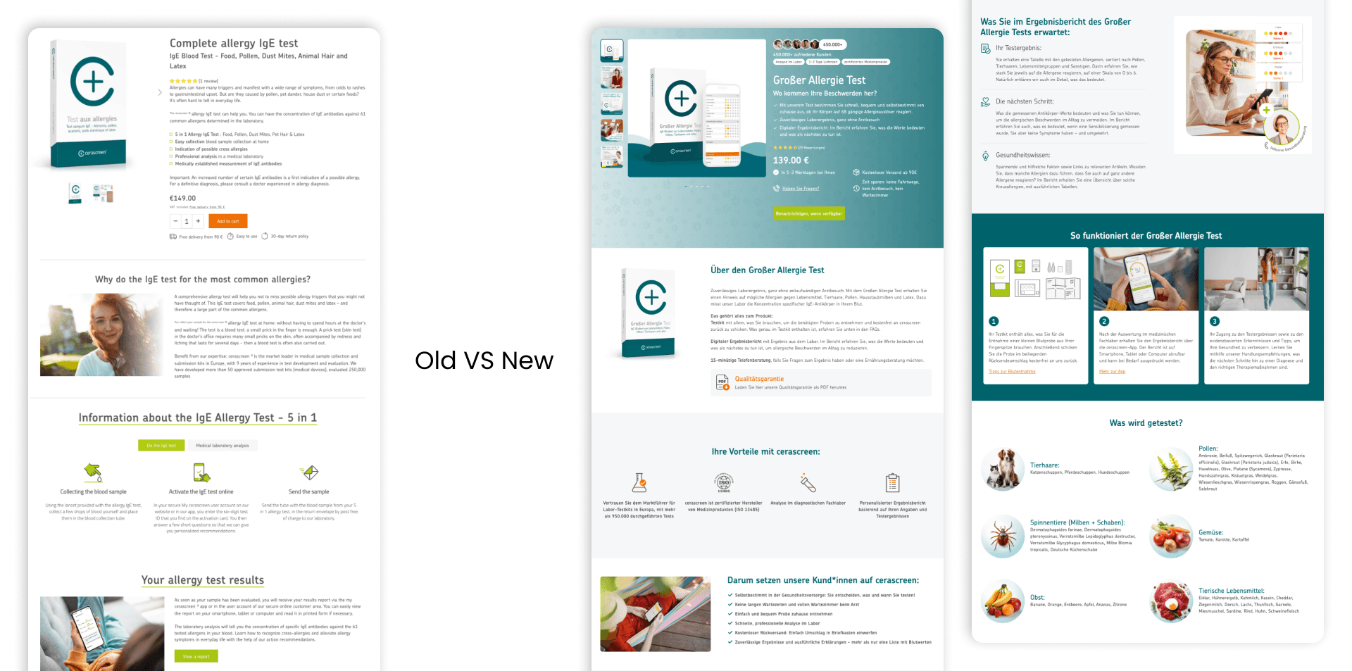
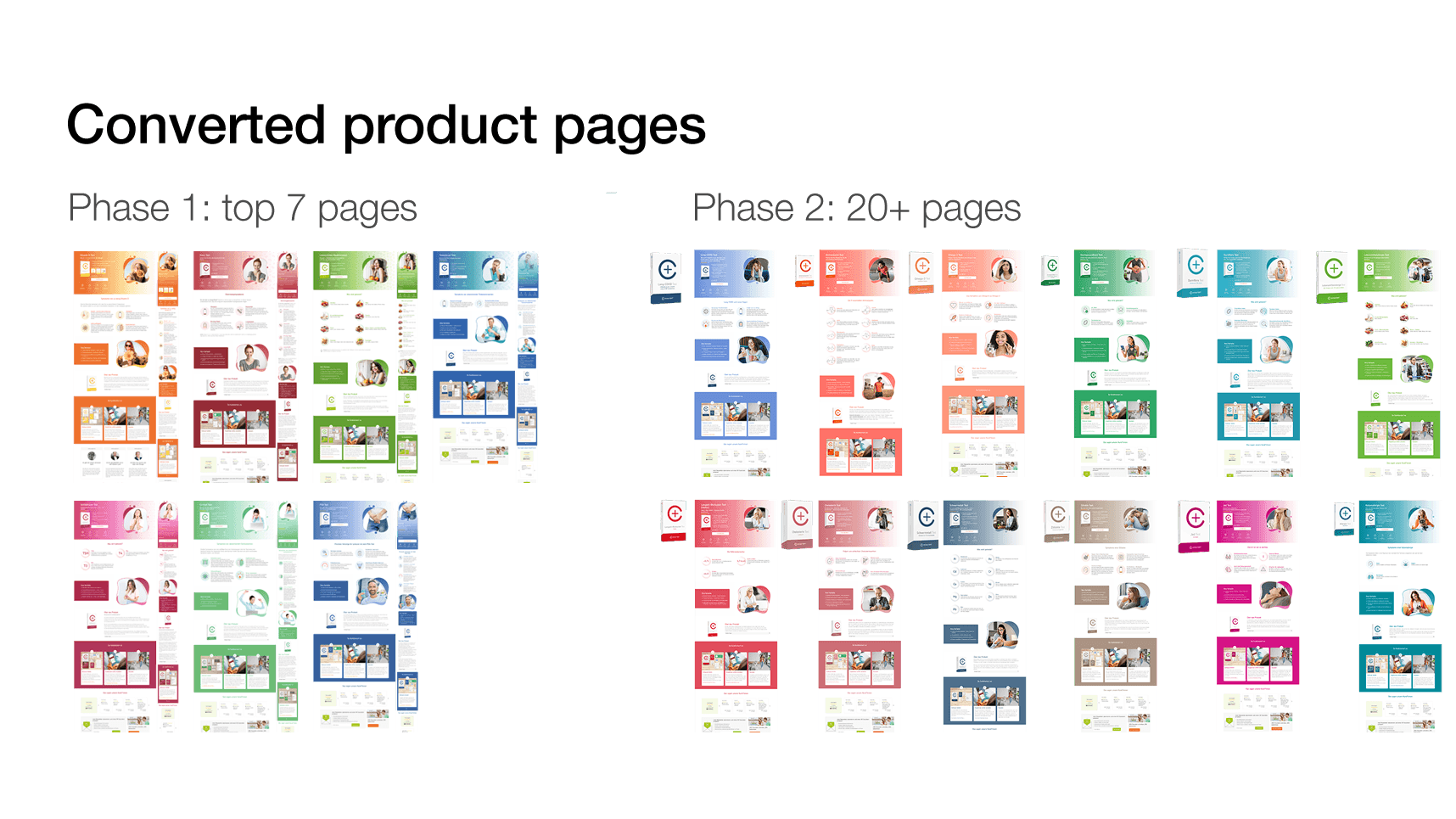
Converting the pages
We converted the pages in two separate phases. In the first phase, we updated the most popular products to the new layout by creating relevant content and assets for each one. An A/B test was created for each product page in this phase to measure its individual performance. In the second phase, we decided to convert the remaining pages without running any A/B tests, as the results from phase one already showed clear improvements in key KPIs.
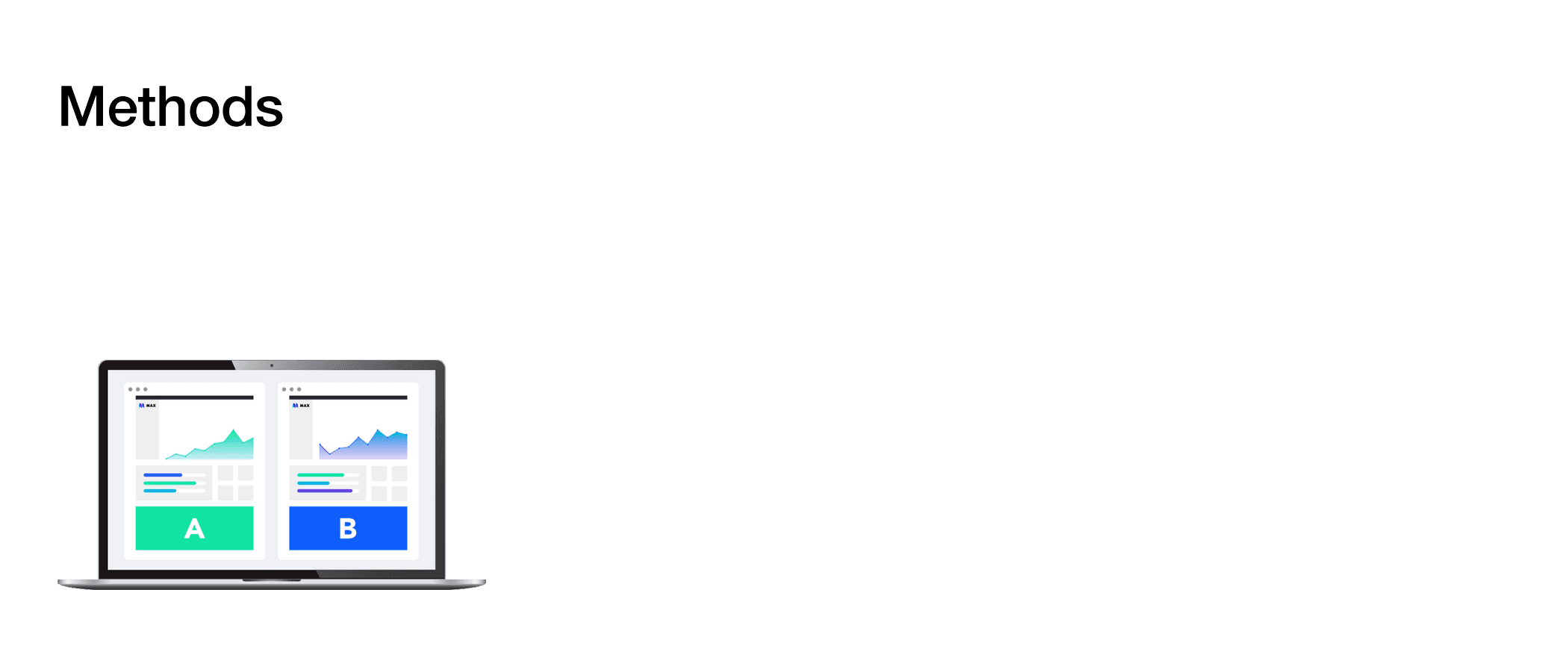
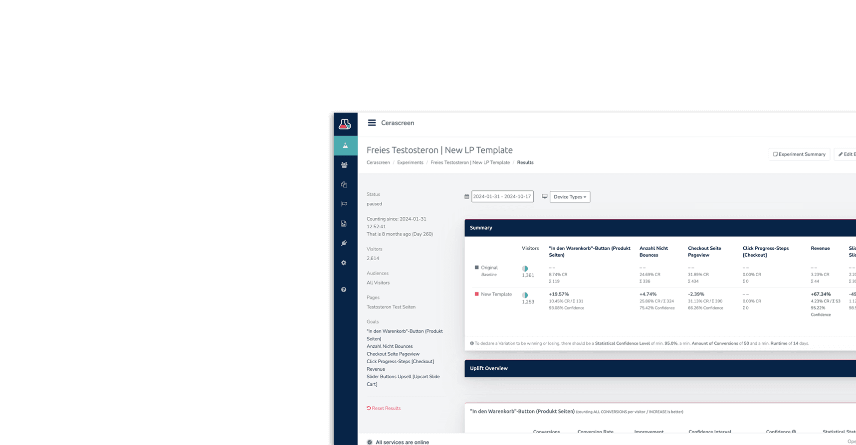
A/B Test
We tested the redesigned product pages against the originals to measure real impact. The results showed clear improvement in key metrics.
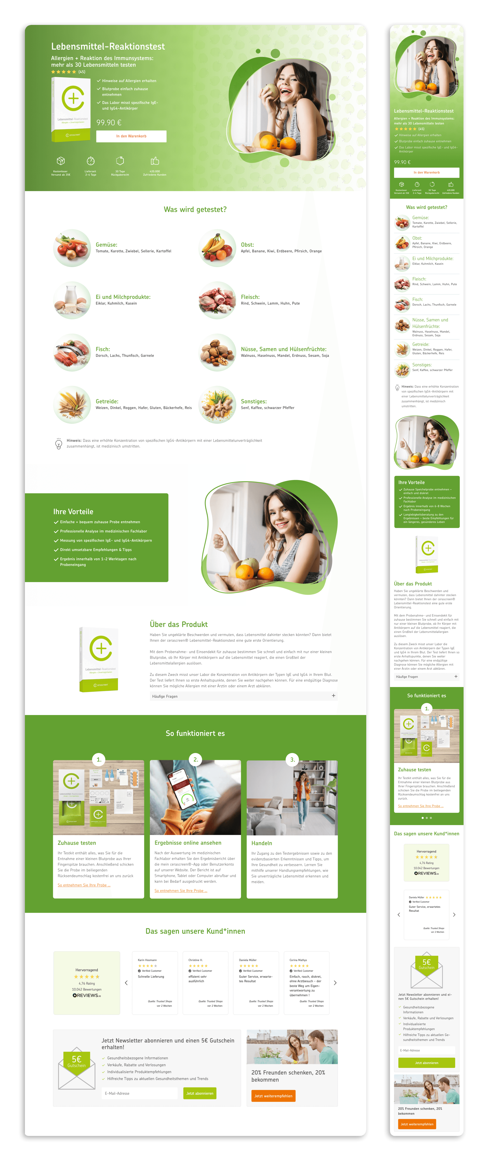
Selected final mockup
This high-fidelity mockups bring together insights from research, usability testing, and business goals. The design focuses on clarity, trust, and conversion—featuring a prominent price, simplified product highlights, and a visual breakdown of the tested food categories (in this example). The layout adapts seamlessly across desktop and mobile to support a smooth purchase journey.