Improving Engagement & Clarity of a Mobile Health App
COMPANY
Cerascreen
ROLE
Product Designer
PLATFORM
iOS and Android
YEAR
2023 - 2024
Improving Engagement & Clarity of a Mobile Health App
COMPANY
Cerascreen
ROLE
Product Designer
PLATFORM
iOS and Android
YEAR
2023 - 2024
Improving Engagement & Clarity of a Mobile Health App
COMPANY
Cerascreen
ROLE
Product Designer
PLATFORM
iOS and Android
YEAR
2023 - 2024
Project description
The app worked technically but users struggled to find their results, gave up during test activation, and rarely came back after their first visit. I led the redesign to fix the core experience and give people a reason to return.
"Why can't the app remember my data from the last test?"
"There are too many screens, it takes forever to finish."
"I lost patience halfway through."
The app worked technically but users struggled to find their results, gave up during test activation, and rarely came back after their first visit. I led the redesign to fix the core experience and give people a reason to return.
"Why can't the app remember my data from the last test?"
"There are too many screens, it takes forever to finish."
"I lost patience halfway through."

Impact
−65% activation time (20 steps → 8)
−68% support tickets (My Tests tab)
−38% navigation errors (result experience)
−45% time to reach results (findability)
~2x add-to-cart with Symptom check vs. direct product page
+44% user satisfaction score (activation flow)
Research & Analysis
I surveyed 50 active users, reviewed support tickets, and analysed five competitor apps. The pattern was clear: 58% of users couldn't find their results, 25% wanted wearable integration, and users were open to personalised guidance if it felt honest.
The Challenge
The app worked technically but users only opened it twice: to activate a test and to check results. Then they left. Activation was a 19-step wall that caused drop-offs. The My Tests tab gave no status feedback, generating constant support tickets. And after results arrived, the app went silent, generic notifications instead of guidance, at exactly the moment users needed clarity most. Research showed 25% of users wanted wearable integration and most were open to personalised health guidance. The new features weren't additions, they were the answer to a retention problem.
The Challenge
Signing up and activating a test kit had too many steps and unclear instructions. Many users gave up before finishing. Then, finding results was another wall. Labels were confusing and there was no guidance on what to do next. People felt lost at exactly the moment they needed clarity most.
What I Designed
What I Designed

Test Activation Flow
19 screens down to 8. I moved repeated data to profile setup and merged multiple questions per screen, cutting activation time by 65%.

Result Experience
Redesigned the result tab with clearer status labels and better hierarchy — support tickets dropped 68% and users scanned each entry 52% faster.
AI Health Consultant
Users knew something felt off but didn't know which test to take. I designed a guided symptom flow with plain language and transparent reasoning. The focus was on feeling supportive, not salesy.
Symptom Check
A step by step flow from symptom to recommendation. In prototype testing it showed 2x higher add-to-cart compared to direct product pages. Users trusted it because it felt personal.
Wearable Integration
I designed the connection flow for Fitbit, Oura, and Apple Health so users could see all their health data in one place. Validated in testing, handed off as a roadmap item.
*Wearable integration and AI features were validated and handed off as roadmap items. They were not shipped during my time at the company.
I designed the connection flow for Fitbit, Oura, and Apple Health so users could see all their health data in one place. Validated in testing, handed off as a roadmap item.
*Wearable integration and AI features were validated and handed off as roadmap items. They were not shipped during my time at the company.

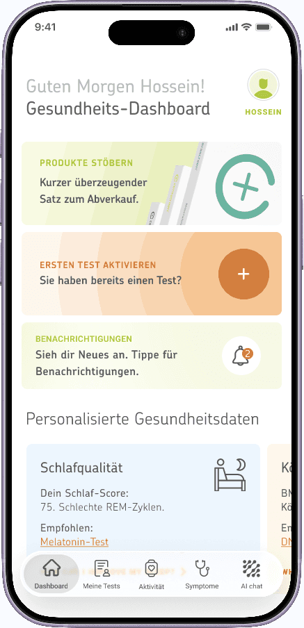
Dashboard Redesign
Replaced an overwhelming layout with a focused view showing what mattered most: latest results, pending actions, and next steps.

Design System & Library
No shared library existed across the app. I built one from scratch covering all flows, giving the team consistent foundations and faster delivery going forward.
Collaboration
I worked with the PM, two engineers, and the marketing team. The design system was inconsistent across screens so I aligned components and documented the gaps as part of the project.
What I Learned
Fixing usability wasn't enough. The deeper problem was that users had no reason to return between tests, and no guidance when they did. This shifted how I approached every decision: not just 'can the user complete this task' but 'does this give them a reason to come back?'
The activation flow taught me that frustration compounds. Each redundant screen wasn't just one extra tap, it was one more signal that the product didn't respect the user's time. Removing friction has a multiplier effect.
The dashboard redesign taught me that silence after a result is a missed opportunity. Users received health data and felt alone with it. Replacing generic notifications with personalised guidance wasn't a feature addition, it was the product finally doing its job.
And building the design system from scratch mid-project taught me something practical: inconsistency isn't just a design problem, it's a delivery problem. A shared library made every subsequent decision faster and every shipped screen more consistent.
Fixing usability wasn't enough. The deeper problem was that users had no reason to return between tests, and no guidance when they did. This shifted how I approached every decision: not just 'can the user complete this task' but 'does this give them a reason to come back?'
The activation flow taught me that frustration compounds. Each redundant screen wasn't just one extra tap, it was one more signal that the product didn't respect the user's time. Removing friction has a multiplier effect.
The dashboard redesign taught me that silence after a result is a missed opportunity. Users received health data and felt alone with it. Replacing generic notifications with personalised guidance wasn't a feature addition, it was the product finally doing its job.
And building the design system from scratch mid-project taught me something practical: inconsistency isn't just a design problem, it's a delivery problem. A shared library made every subsequent decision faster and every shipped screen more consistent.